Beyond Product Design - Branding
Artichoke
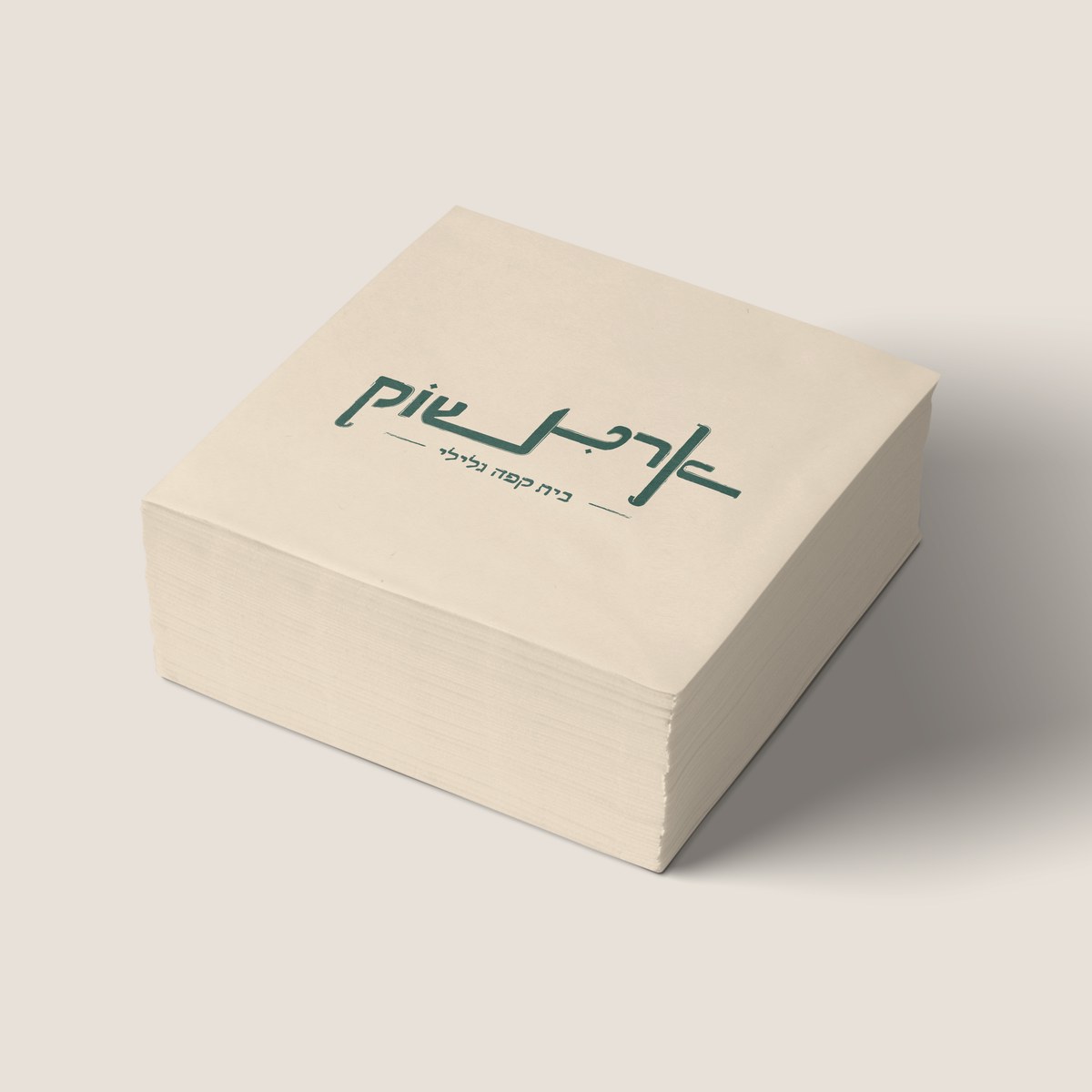
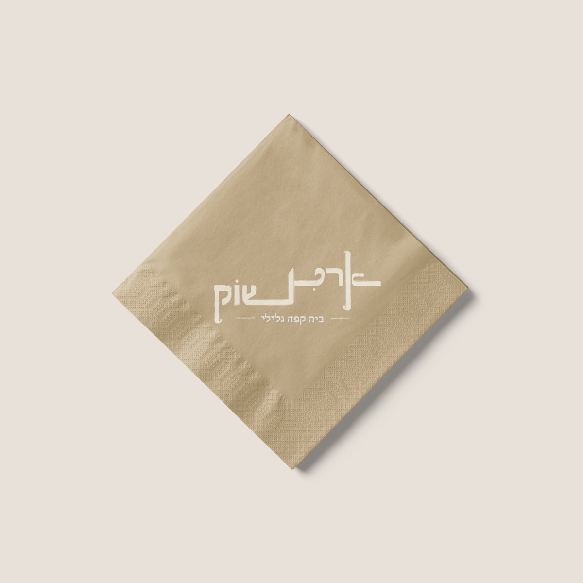
Artichoke (ארטישוק) is a wordmark and brand mark for a fictional coffee house in the Galilee, designed in a logotype workshop led by Ariel Adler. The brief was narrow on purpose: take one name and turn it into a single, deliberate mark.
- Role
- Solo - Logotype Design
- Course
- Logotype Workshop
- Guided by
- Ariel Adler
- Timeline
- 2023
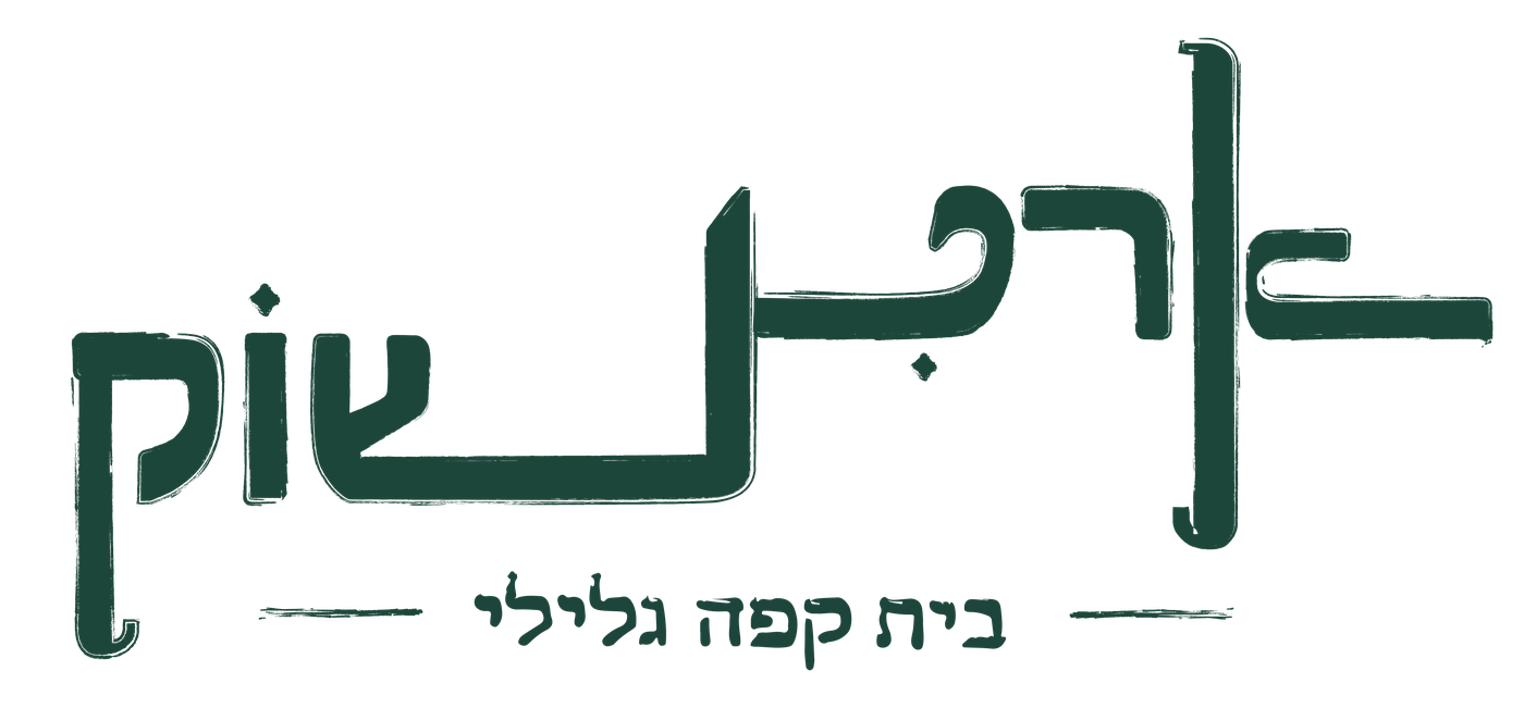
One word, built by hand
The workshop's focus was letterforms, not brand strategy - one name, redrawn until it reads as a single shape rather than a row of typed letters. Artichoke, which doubles as the Hebrew word for the vegetable, became that name, paired with an imagined Galilee coffee house to give the letters somewhere to live.
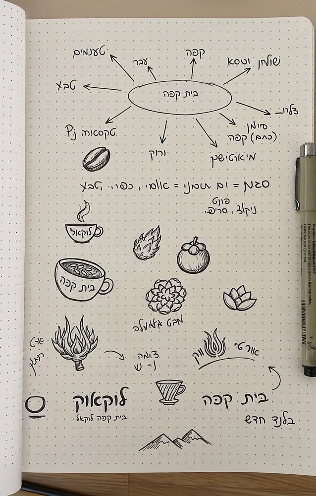
From rules to a finished system
The brief kept coming back to two rules: a good logo has one clear focal point, and good typography treats every letter as part of a single image, not a row of separate glyphs.
Deep Ink
#1D463B
White
#FFFFFF
Cream
#E8E1D9
© Designed & built by Lior Shitrit with AI tools.