Offri’s Event App
A personal frustration with friends over messy event coordination, turned into a small team’s app concept - with me leading product design end-to-end.
- Role
- Product Designer (research through UI)
- Timeline
- 2023
- Team
- Product manager, 2 full-stack engineers
- Tools
- Figma, prototyping
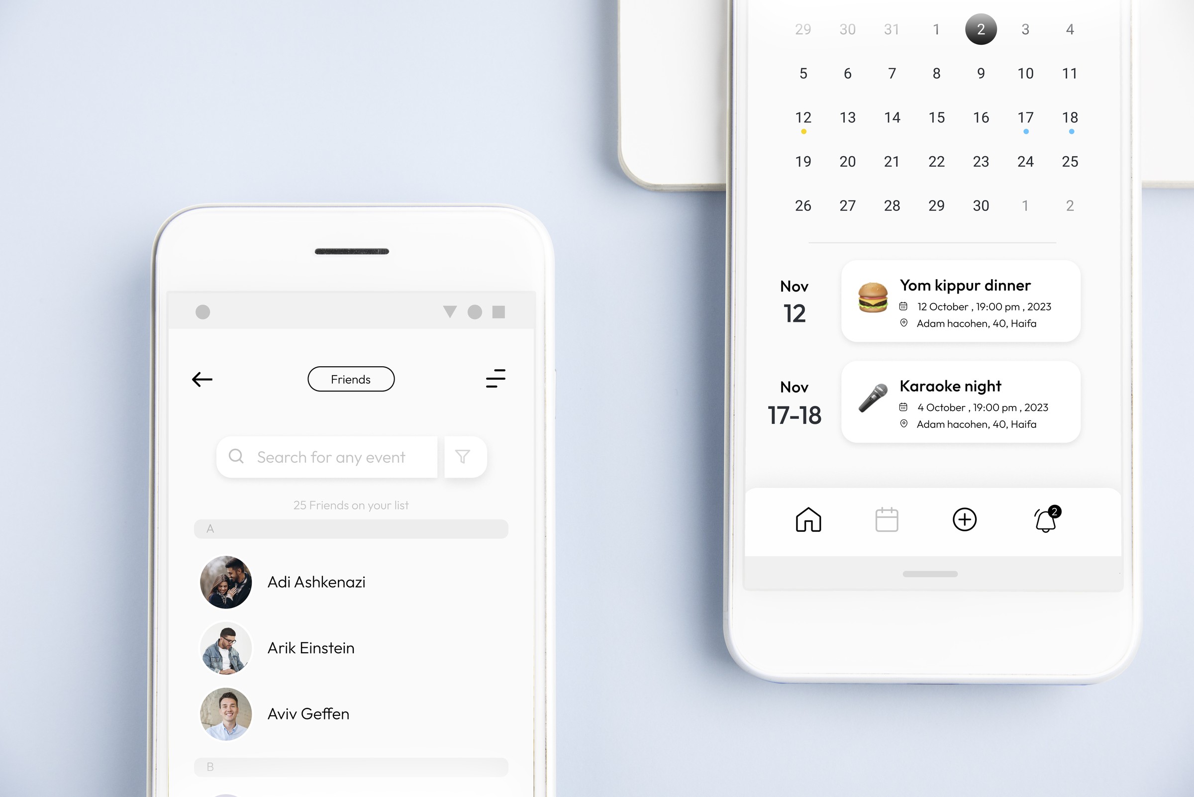
Offri’s started as a real problem: my friends and I kept losing track of event details, guest lists, and communication across group chats and spreadsheets. I partnered with a product manager and two engineers to design an event-planning app end-to-end - owning the user flow mapping, and visual design, down to UI refined through several rounds of feedback.
Where this lived, and what I owned
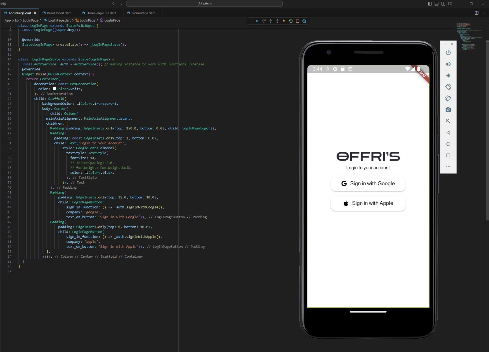
Offri came out of a problem my friends and I kept running into ourselves: planning even a simple event meant juggling scheduling, guest lists, and updates across chats, spreadsheets, and notes, which made the process disorganized and stressful more often than it should have been. I partnered with a product manager, Ofri Yehuda, and two full-stack engineers, Aviv Shitrit and Tom Mouwes, to turn that frustration into a real app concept - the name is a nod to Ofri. I owned product design end-to-end: research and personas, the user flow map, visual and interaction design, and the prototype.
Concrete pain points
- 01
Coordination happened across too many tools
Scheduling, guest lists, and updates for a single event were split across chats, spreadsheets, and notes.
- 02
Guest lists and RSVPs were tracked by hand
Invites and responses lived in group chats and spreadsheets - easy to lose track of and slow to update.
- 03
Existing apps solved only half the problem
Event platforms like Eventbrite and Meetup, and calendar tools like Google Calendar, Cozi, and TeamUp, each covered part of event planning or shared scheduling, but not both together.
From problem to design opportunity
- Coordination spread across toolsA single app that carries an event from creation through the day itself.
- Manual guest trackingGuest lists and RSVPs built into the event, not bolted on.
- Existing apps only cover half the jobCombine what event-planning apps and shared-calendar apps each do well into one place.
- No quick read on what’s coming upOpen the app on a home screen that leads with your next events and where each one stands, so keeping track of the next one takes a glance instead of scrolling back through old messages.
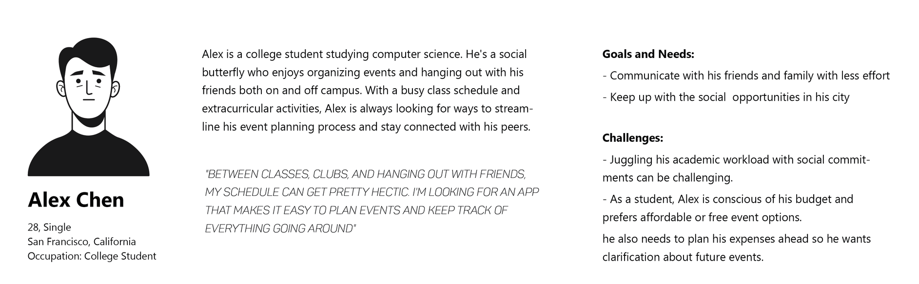
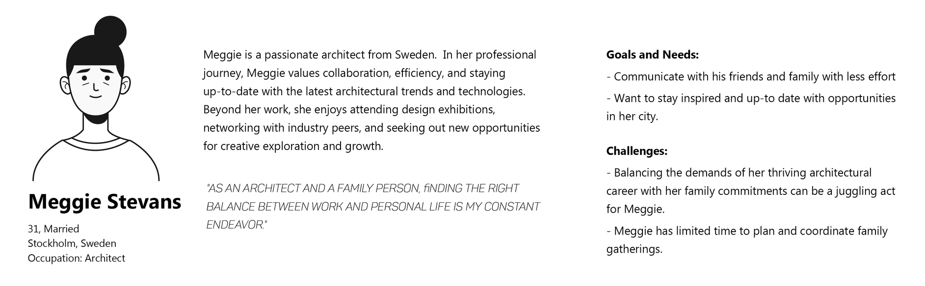
Who we were designing for
The design, and the decisions behind it
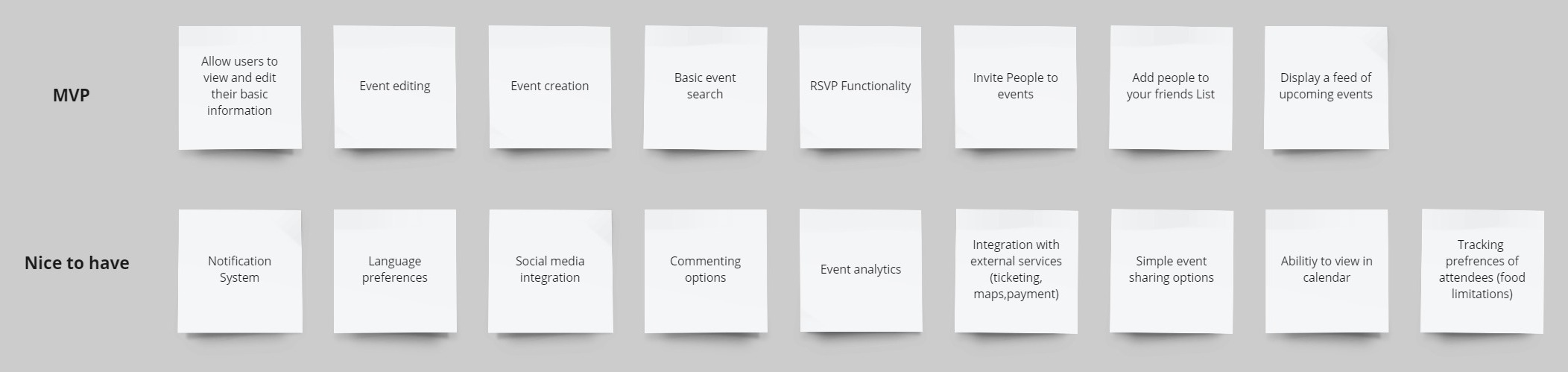
Agree on the smallest useful version first
Everything felt essential at the start, and with two engineers building this alongside their own jobs, a long feature list would have meant nothing shipped at all.
Decision - Sort every idea into an MVP and a nice-to-have list with the team before any screens were designed. Creating and editing an event, RSVPs, invites, the friends list, and a feed of upcoming events made the cut; notifications, analytics, calendar sync, external ticketing and payments, and per-guest food preferences were parked.
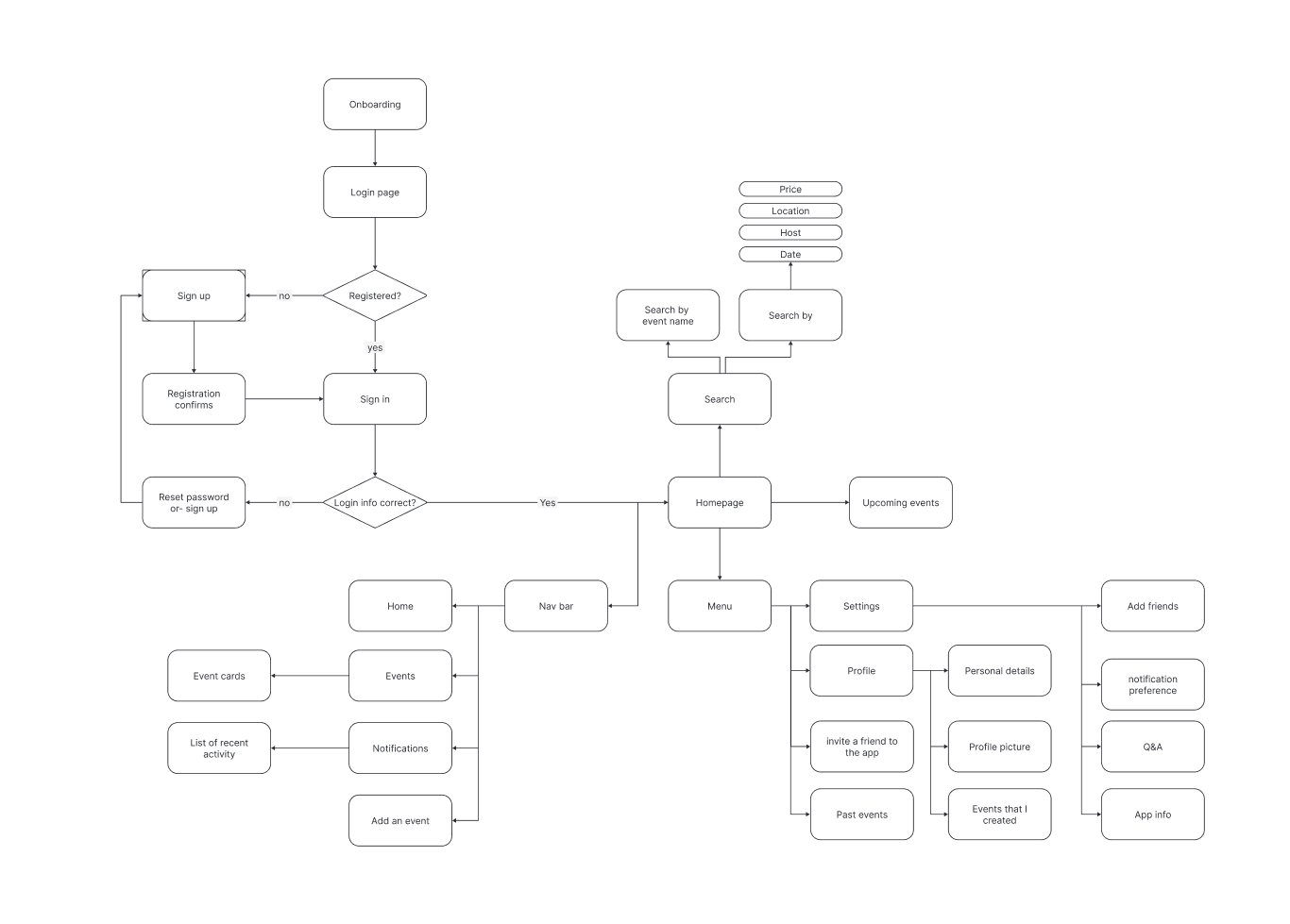
One flow map, start to finish
Creating an event, coordinating guests, and running the day itself had always lived in separate tools, so nothing carried context from one step to the next.
Decision - Map every screen, action, and decision a user makes across the full journey - from creating an event to the day-of schedule - as one connected flow, so the app always knows what happened before it.
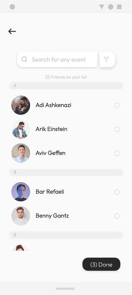
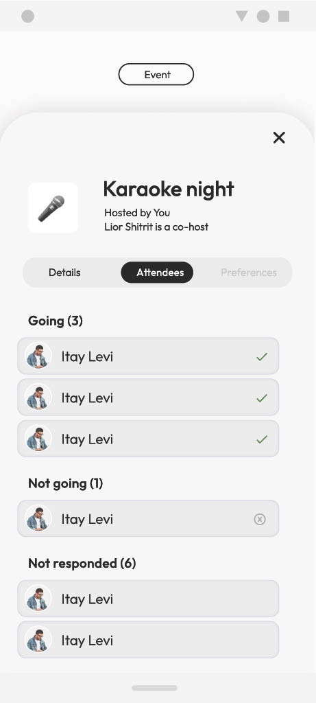
Guest coordination without the spreadsheet
Invites and RSVPs were being tracked by hand in group chats and spreadsheets, and easily got lost or went stale.
Decision - Build guest management directly into the event - invites, RSVP status, and updates all live in one place instead of a side spreadsheet.
UI interface
Event apps in this space tend to borrow visual patterns from ticketing, messaging, and calendar apps all at once, which made most of them feel busy.
Decision - Settle on a single, monochromatic, minimalist visual language, refined over several rounds of feedback with the team, so the interface stayed calm no matter how much event detail it held. Colour earns its place in exactly one job: soft pink and green to mark whether a guest is coming.
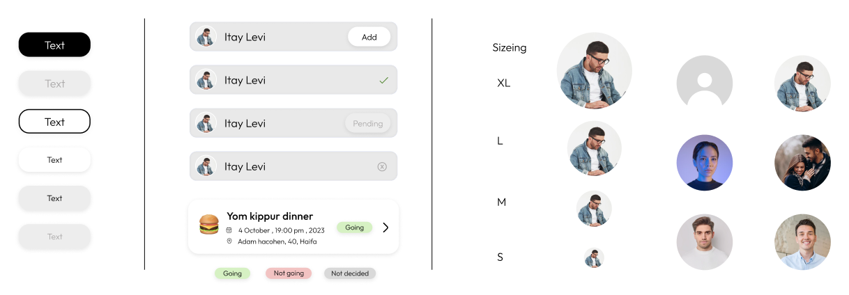
Ink
#000000
Surface
#FEFEFE
Surface muted
#F1F1F1
Neutral
#D9D9D9
Going
#D5F1C3
Not going
#F1C3C3
What I took away
- 01
This was the first time I worked alongside a product manager and engineers, and it changed how I scoped the work - I was designing for what could actually get built, not just for what looked good in Figma.
- 02
Studying five existing apps side by side made the gap obvious: event tools and calendar tools solve adjacent problems, but almost none combine them.
- 03
Committing to one flow map before touching visual design kept the guest and scheduling features connected instead of bolted on separately.
- 04
A minimalist, monochromatic UI held up well under real event detail - simplicity did more work than any single feature.
The experience
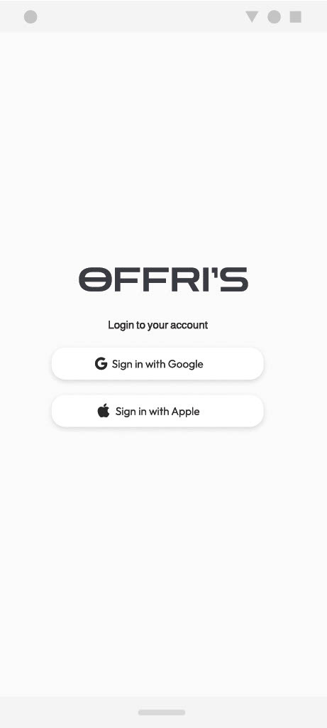
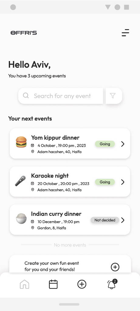
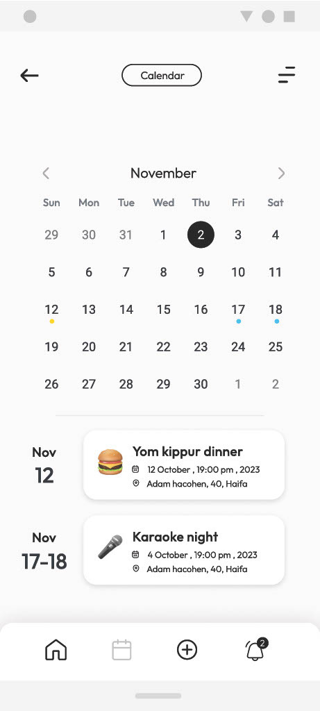
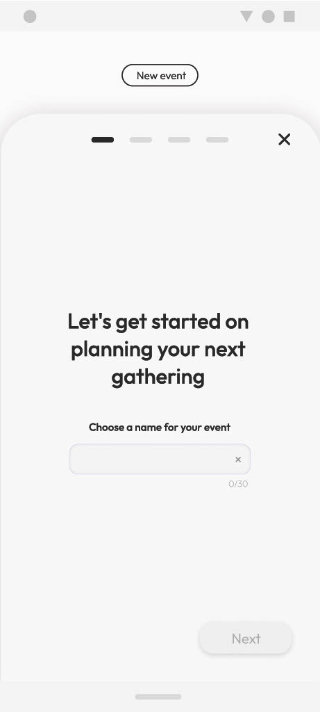
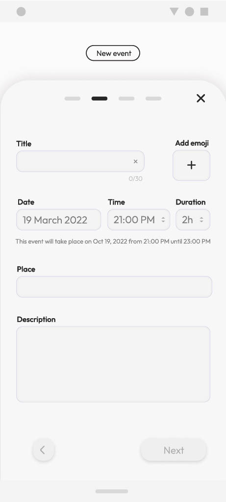
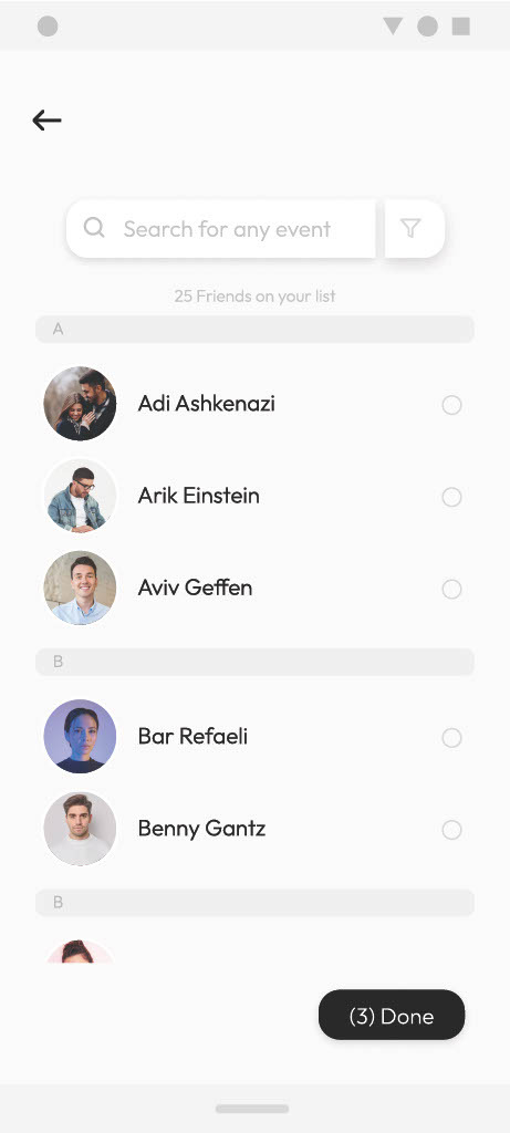
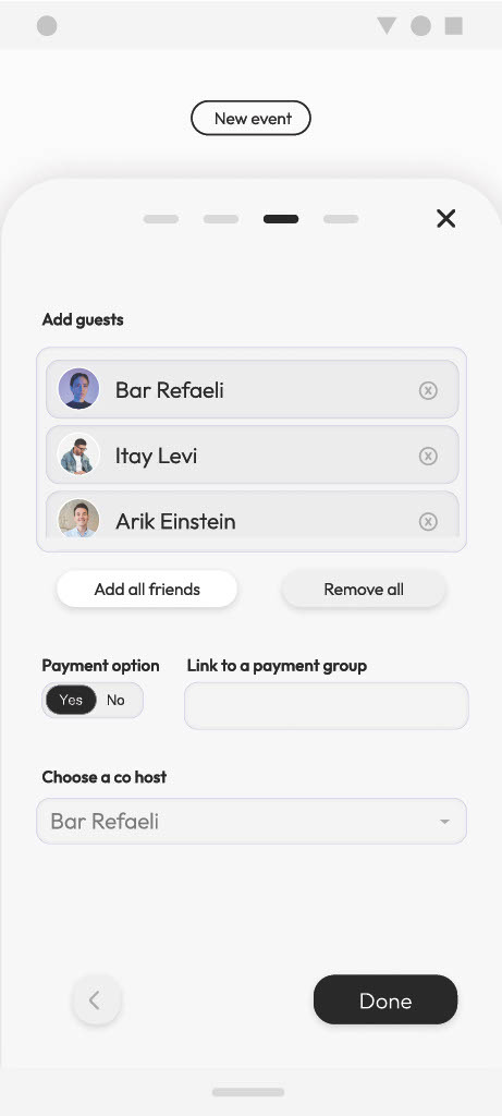
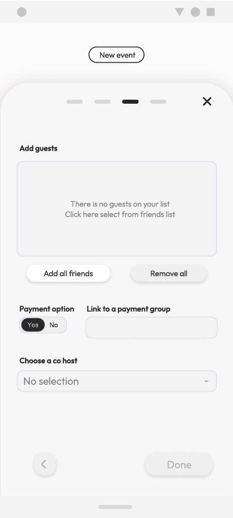
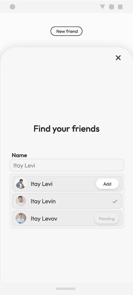
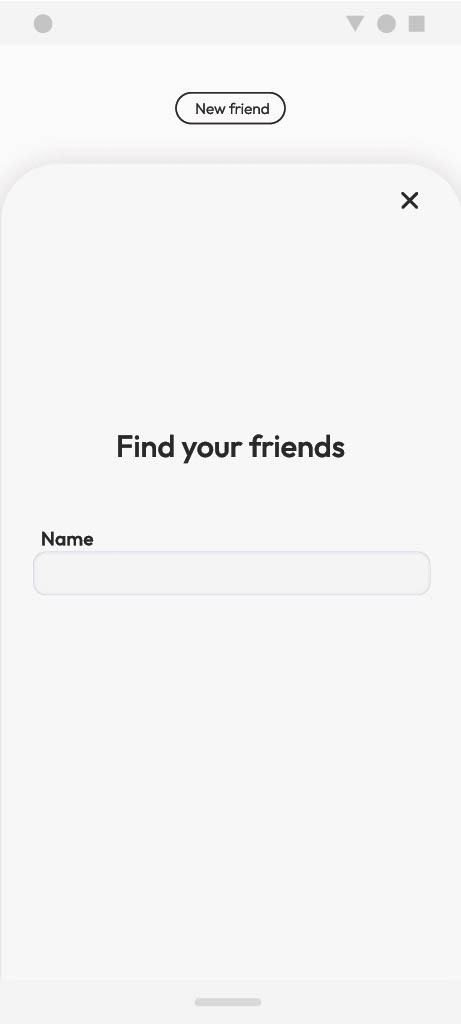
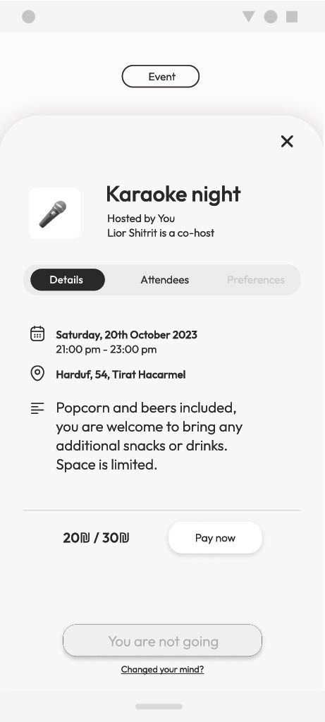
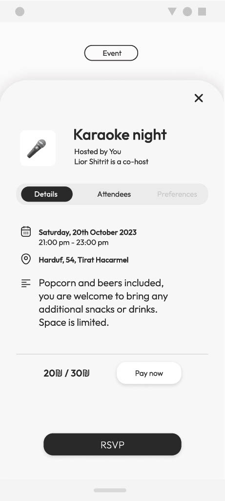
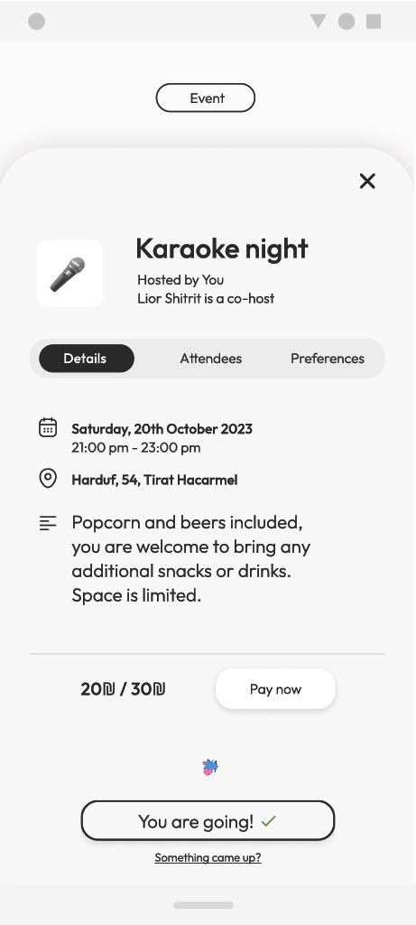
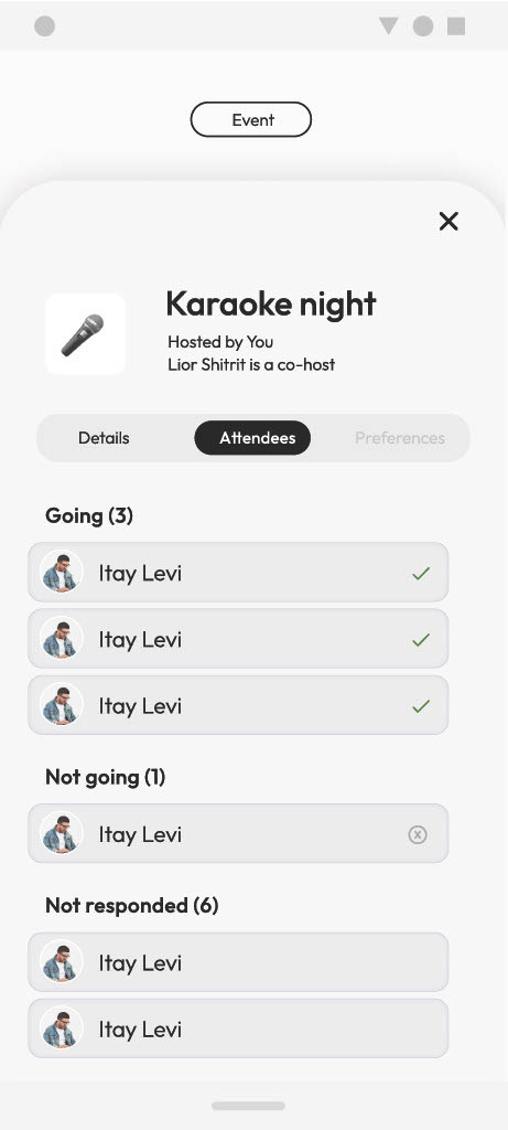
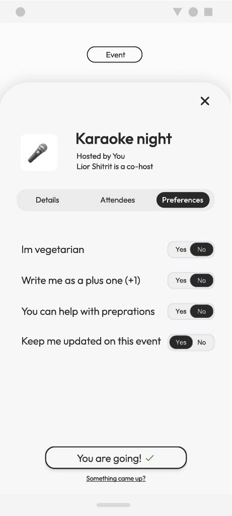
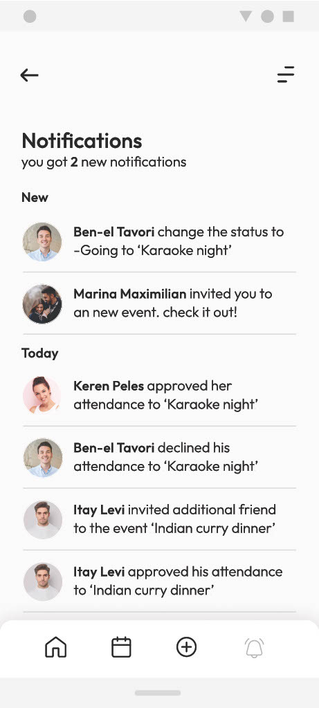

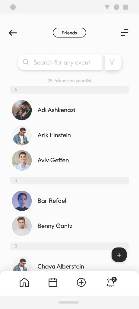
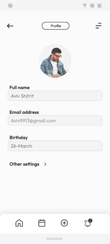
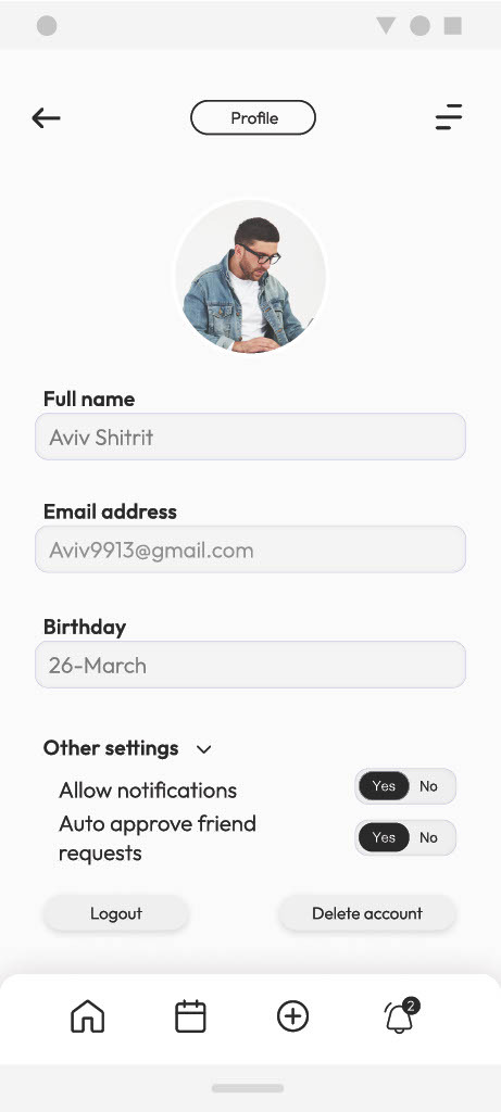
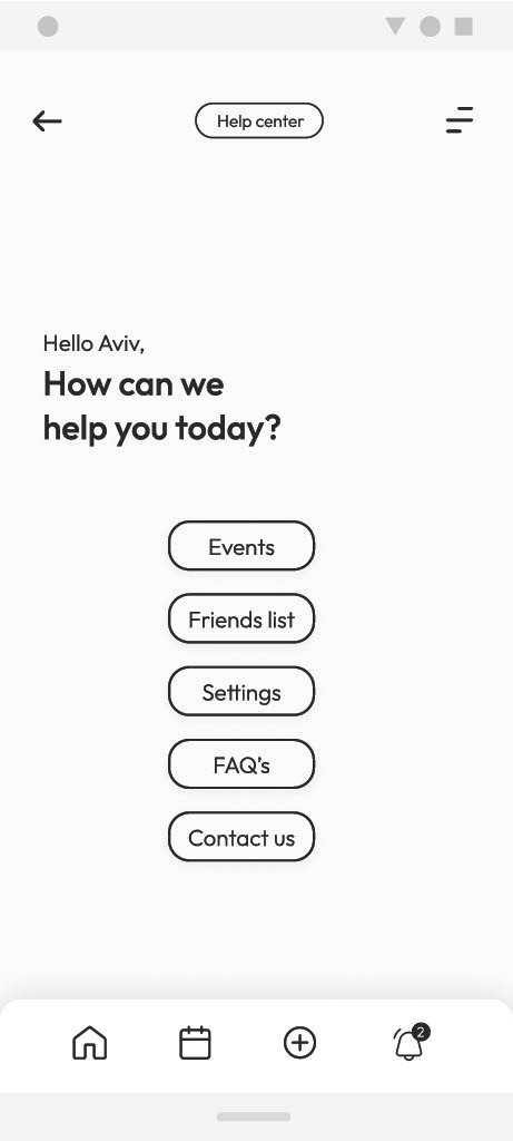
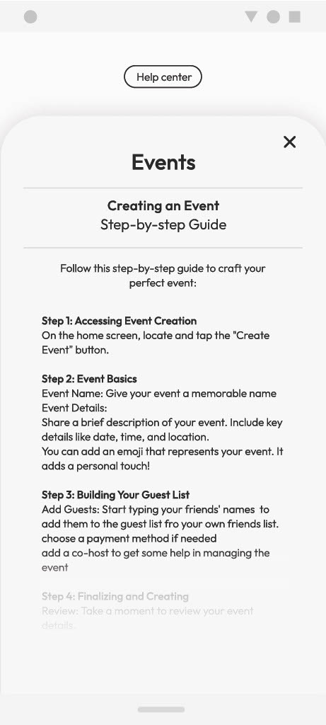
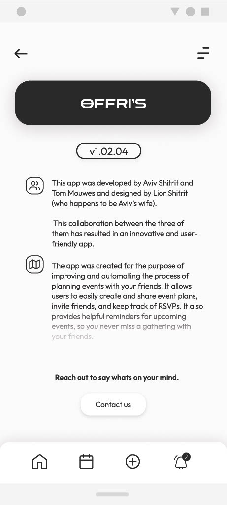

The prototype showcases the app’s minimalist design and user-friendly interface, giving a clear demonstration of how it works and how it feels to move through.
Open the Figma file© Designed & built by Lior Shitrit with AI tools.