On-Call Scheduling
Bringing on-call into Service Operations Workspace - a colour language three product teams could build against, and a grid where every conflict surfaces its own fix.
- Role
- Product Designer (UX & UI)
- Shipped
- Store release, Feb & May 2024
- Scope
- 2 sub-products in one workspace
- Teams
- On-Call, SRM & WFO · 3 time zones
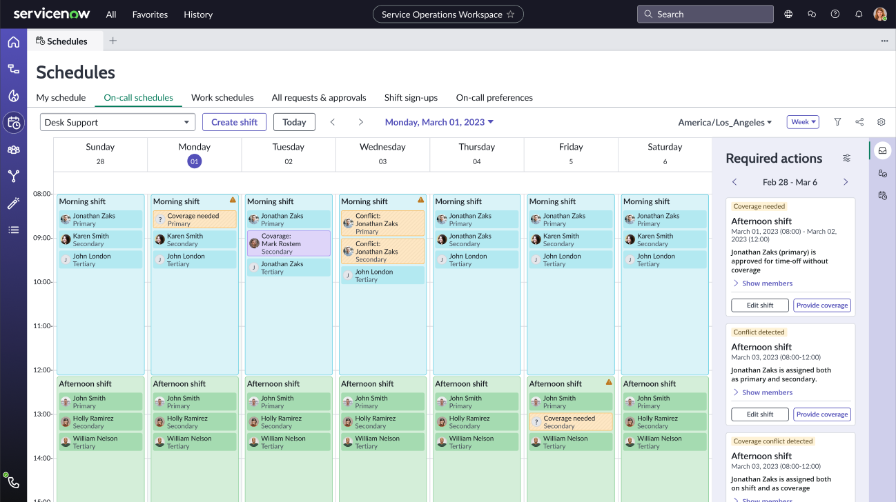
On-Call Scheduling is how responders know who is covering incidents at any given hour. I designed it into ServiceNow’s Service Operations Workspace as two connected surfaces - the team’s on-call schedule and the flow managers use to build rotations - for IT service desk agents, SREs and NOC operators. Because two sibling products in the same workspace would consume the same schedule data, the work was as much specification as screen design: one Polaris colour token per event type, in light and dark theme, that three teams in three time zones could all build against. It shipped in the February and May 2024 Store releases.
Where this lived, and what I owned
On-Call Scheduling lives inside Service Operations Workspace, alongside two other products - SRM and WFO - built by separate teams in three different time zones, both of which would surface on-call data in their own experiences. It serves three responder personas: IT service desk agents resolving hardware and software incidents, SRE agents accountable for availability, performance, security and maintainability, and NOC operators monitoring data-centre infrastructure, servers and networks around the clock. I owned the design of two sub-products - the team’s on-call schedule and the manager-facing schedule creation flow - alongside a partner designer and the PM, and with the SRM and WFO teams on everything they would reuse.
Concrete pain points
- 01
On-call sat beside the work, not inside it
Responders already lived in Service Operations Workspace. On-call needed to become native surfaces there rather than another destination to leave the workspace for.
- 02
Three teams were about to style the same thing three ways
On-Call, SRM and WFO were all building into one workspace from three time zones. In a schedule grid colour carries most of the meaning, and nothing stopped each team from choosing its own.
- 03
A coverage gap only existed if someone noticed it
A responder approved for time off with nobody covering, or assigned as both primary and secondary, is a real hole in the rotation - and the grid drew it exactly like a shift that was fine.
From problem to design opportunity
- On-call outside the agent’s workspaceDesign it as native SOW surfaces, so a responder never has to leave the workspace to answer a scheduling question.
- Three teams, three time zones, one workspaceSpecify the shift block and its colour semantics once, on Polaris tokens, so On-Call, SRM and WFO all render a shift identically.
- Gaps and conflicts drawn like ordinary shiftsDetect them, draw them as their own state, and collect them into a list that carries the fix alongside the problem.
Who we were designing for
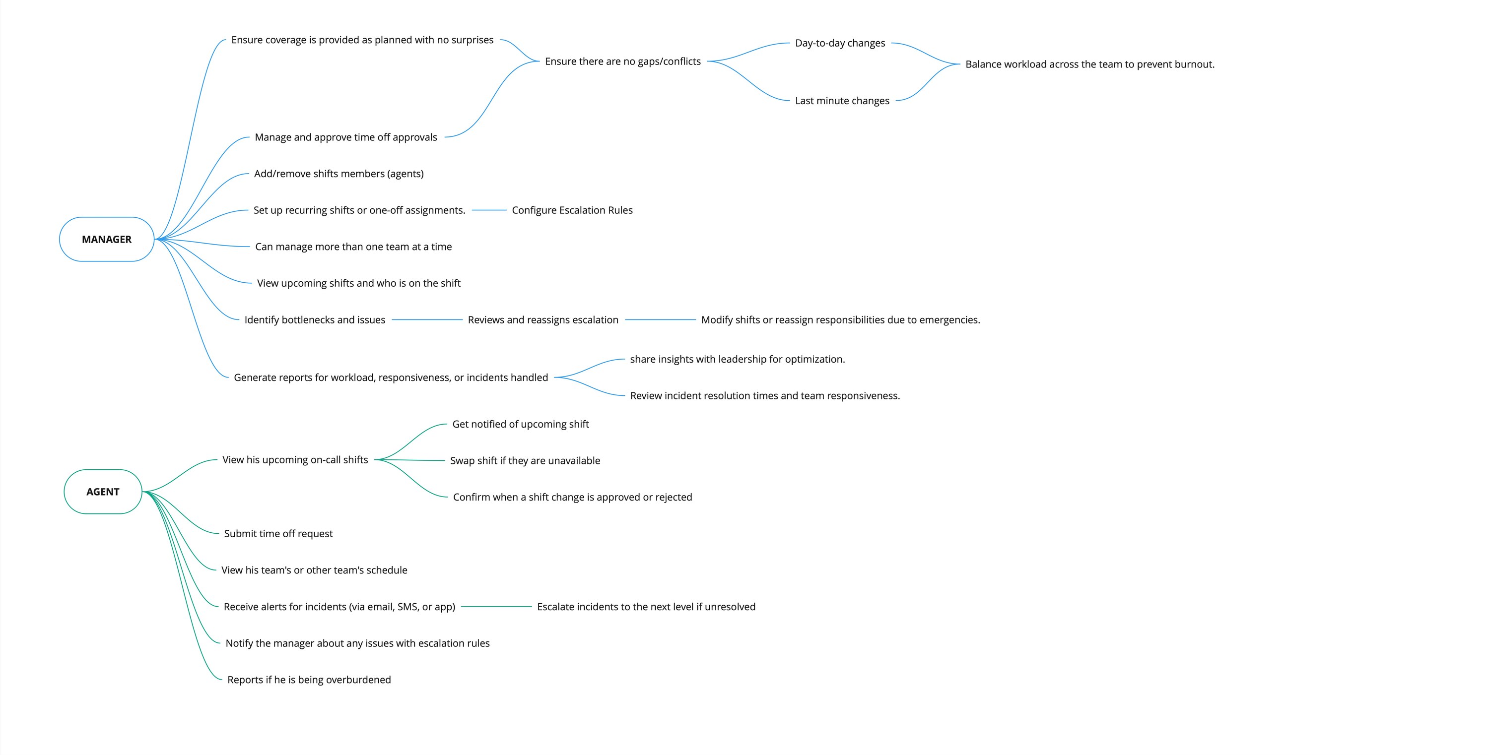
Grounding the work in real needs
Discovery centred on separating what a manager needs from what an agent needs - they read the same schedule for almost opposite reasons. I mapped both sets of objectives before designing any screen; the map above is that artefact. Details are generalised here to respect confidentiality.
Primary persona
The On-Call Agent
IT service desk, SRE or NOC operator in a rotation
Goals
- See upcoming on-call shifts, and get notified before one starts
- Swap a shift when unavailable, then confirm whether it was approved or rejected
- Receive incident alerts by email, SMS or app, and escalate when unresolved
- Check their own team’s schedule - or another team’s
Frustrations
- No way to flag being overburdened before it turned into burnout
- Not knowing whether a time-off request or shift swap had actually gone through
What the design changed
The design, and the decisions behind it
The two surfaces share one grid and one set of shift components, so a responder learns the pattern once and it holds everywhere - including inside the two sibling products that consume it. Every screen below is the real product running on demo data.
One shift block, specified down to the token
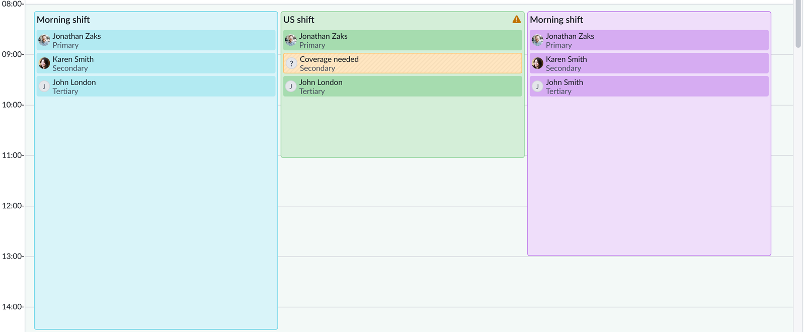
The shift block is the atom of this product. It appears in the team grid, in the manager creation flow, and in both sibling products - so if each team built its own, the workspace would read as three products stitched together.
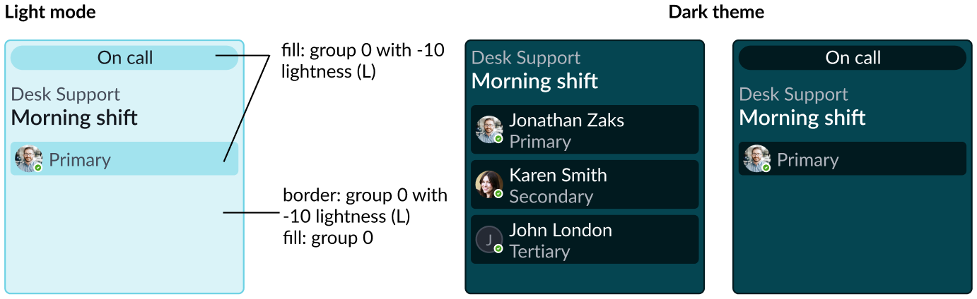
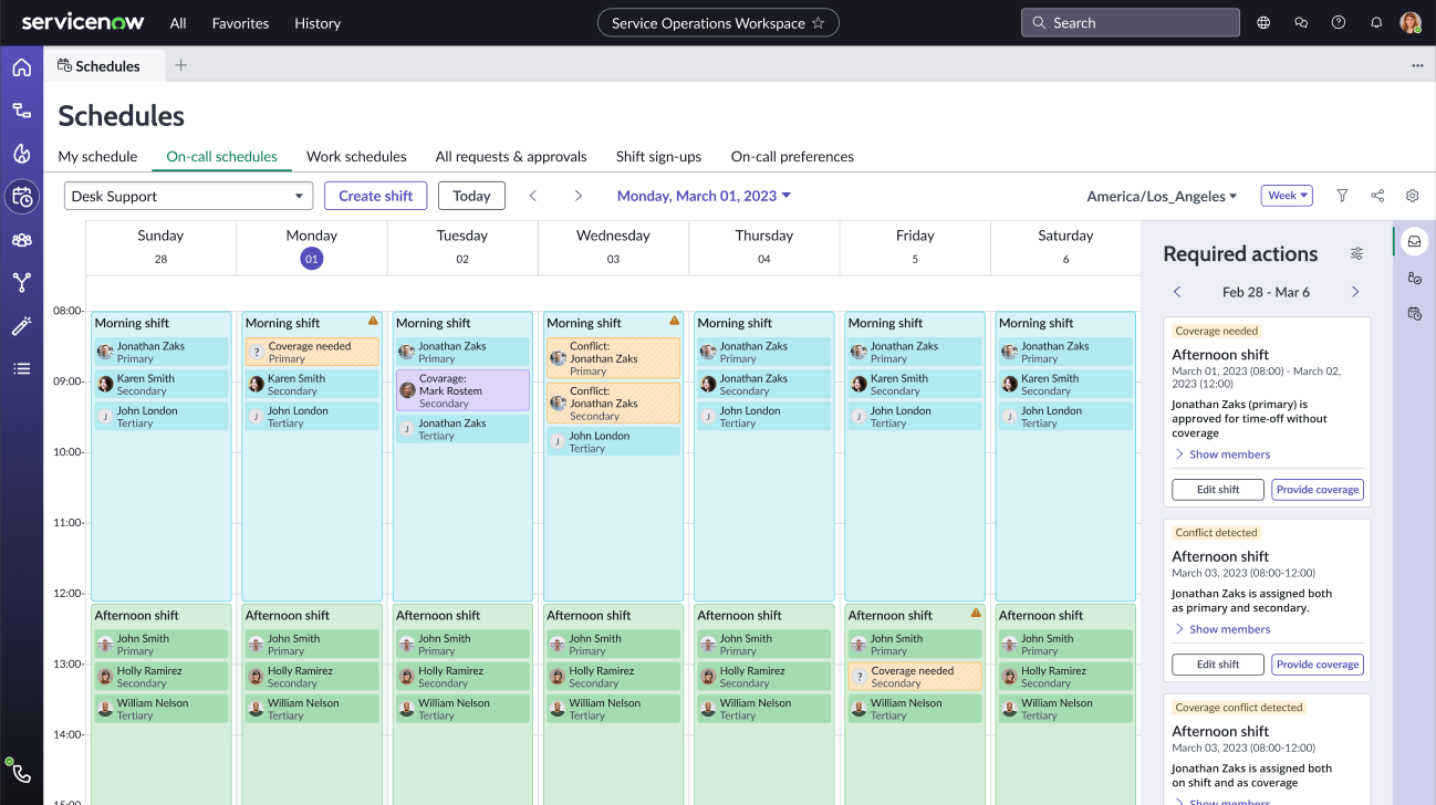
Decision - I specified the block itself: an “On call” status pill, the team name above the shift name, and one row per responder carrying their role. Fill and border both derive from a single assigned colour - the border and the secondary role rows are that same colour at −10 lightness - so adding an event type means choosing one token, not picking five values.
Colour as a shared semantic, not a per-team decision
In a dense grid colour is read before text, which makes it the highest-leverage thing to standardise - and the easiest thing for three teams to quietly diverge on.
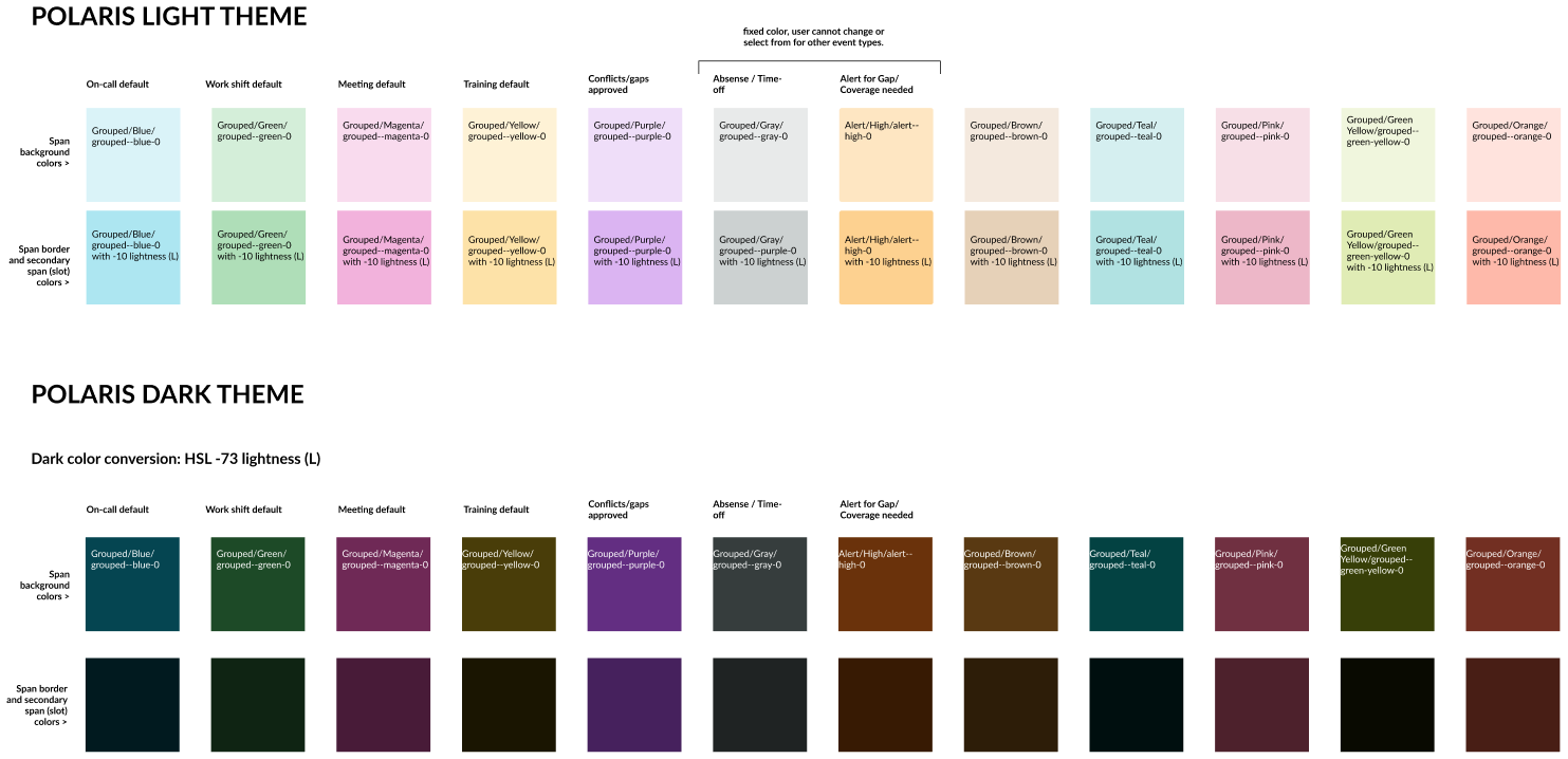
Decision - I mapped every event type to one Polaris token: on-call blue, work shift green, meeting magenta, training yellow, an approved conflict or gap purple, and the alert token for a coverage gap. Time off is locked to grey and cannot be reassigned to another event type, so an absence never competes with a live shift for attention. The dark theme is that same map through a single conversion - HSL −73 lightness - rather than a second set of hand-picked colours.
On-call
#daf3f8
Work shift
#d4eed9
Meeting
#f9dbee
Training
#fef2d6
Conflict / gap
#efdef9
Coverage needed
#fee6c2
Gaps drawn as gaps, conflicts listed with their fix
The manager objective that came up first was “ensure coverage is provided as planned, with no surprises”. Some surprises can be drawn in a cell - an unfilled slot. Others can’t: a responder approved for time off with no coverage, or assigned as both primary and secondary, is a relationship between two facts rather than one block.
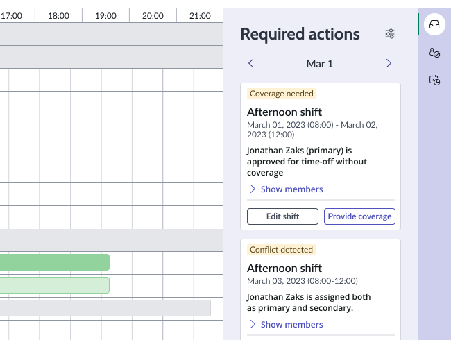
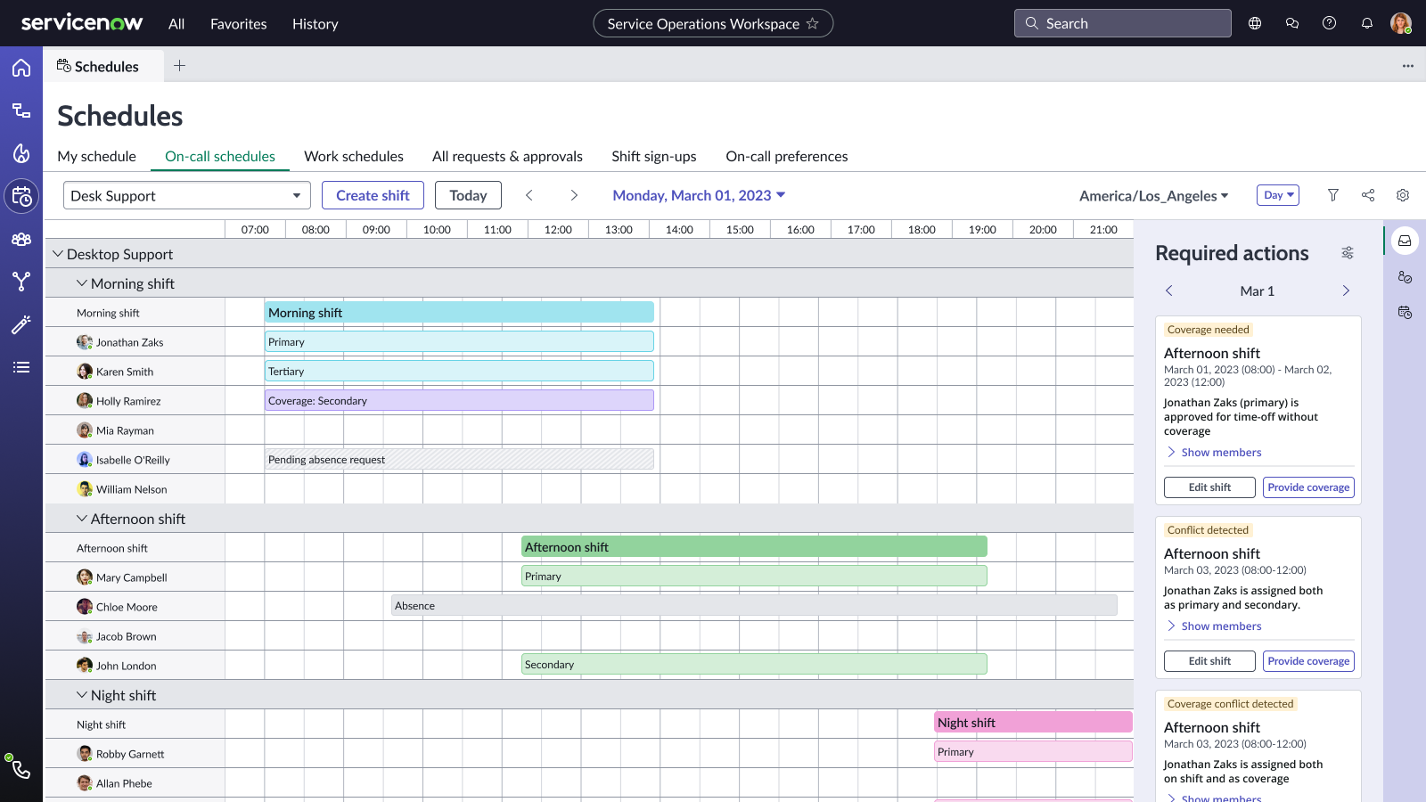
Decision - An unfilled slot became its own state - a hatched “Coverage needed” row in the alert colour, with a warning marker on the shift containing it - so a hole is visible in the same glance that reads the rest of the grid. Everything structural goes to a Required actions panel beside the grid: one card per problem, naming its type, the shift and window affected, and what is wrong in plain language, then offering the two things a manager would actually do next - edit the shift, or provide coverage.
Act on a shift without leaving the grid
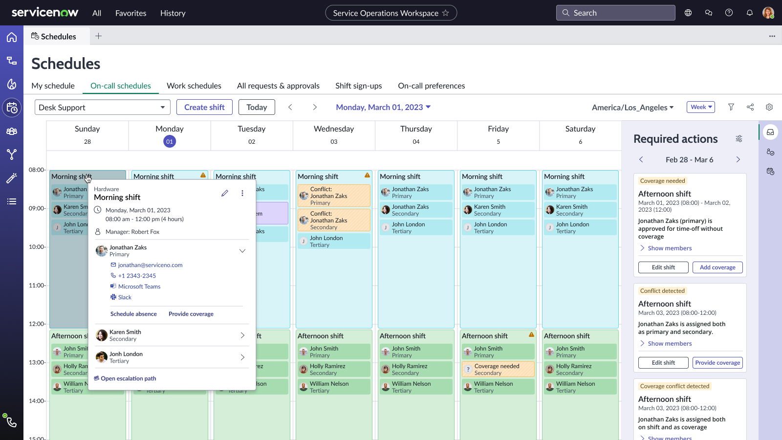
Most scheduling actions begin as a question about a person: who is on this shift, and how do I reach them right now?
Decision - Selecting a shift opens it in place - responders in role order, the channels to reach the primary (email, phone, Teams, Slack), and the two actions most likely to follow: schedule an absence, or provide coverage. The escalation path is one link away rather than a separate configuration screen.
Escalation as a timeline, not a configuration form
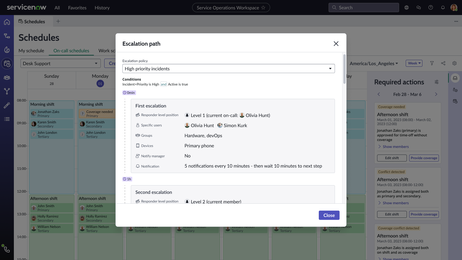
Escalation is where trust breaks down fastest. An agent needs to believe an unresolved incident will actually reach someone; a manager needs to verify the rules do what they think they do.
Decision - The escalation path reads top to bottom as a timeline, with the delay before each step on the spine - zero minutes, then an hour - and each level stating exactly who is reached (responder level, named users, groups), on which device, whether the manager is notified, and the retry cadence before it moves on.
Three time horizons for three different jobs
“Am I on call right now” and “is next month covered” are different questions at different zoom levels, and one grid density cannot serve both.
Decision - Week is the default for reading a rotation. Day expands into a per-person timeline where absences and pending requests sit inline against the hours, so an approval gap is visible on the row it affects. Month steps back far enough to plan and to spot patterns. The view control is identical in all three, so changing horizon never means learning a new screen.
What changed
The work shipped in the ServiceNow Store’s February and May 2024 releases. The figures below describe scope rather than performance - adoption metrics for this product aren’t mine to share.
2
Sub-products designed end to end - the team schedule and the manager creation flow
12
Event-type colour tokens specified, each with a dark-theme counterpart
3
Product teams building against one spec, across three time zones
Shipped in the February and May 2024 ServiceNow Store releases.
SRM and WFO consume the same shift components and colour semantics instead of rebuilding them, so a shift reads as a shift anywhere in the workspace.
Coverage gaps and scheduling conflicts surface as named, actionable cards rather than depending on a manager catching them in the grid.
Light and dark theme were specified together from a single lightness conversion, so adding an event type later is still a one-token decision.
What I took away
- 01
Specifying the smallest unit - one shift block, one token per event type - did more for consistency across three products than reviewing each other’s screens ever would have.
- 02
Detecting a problem is only half a feature. A conflict card that names what is wrong but not what to do about it just moves the work somewhere else.
- 03
Working across three time zones meant the specification had to answer questions on its own, because there was rarely a shared hour in which to ask them.
- 04
Reading the manager and agent objectives side by side is what made it obvious they needed separate surfaces, not different filters on the same grid.
Before / After
 After
After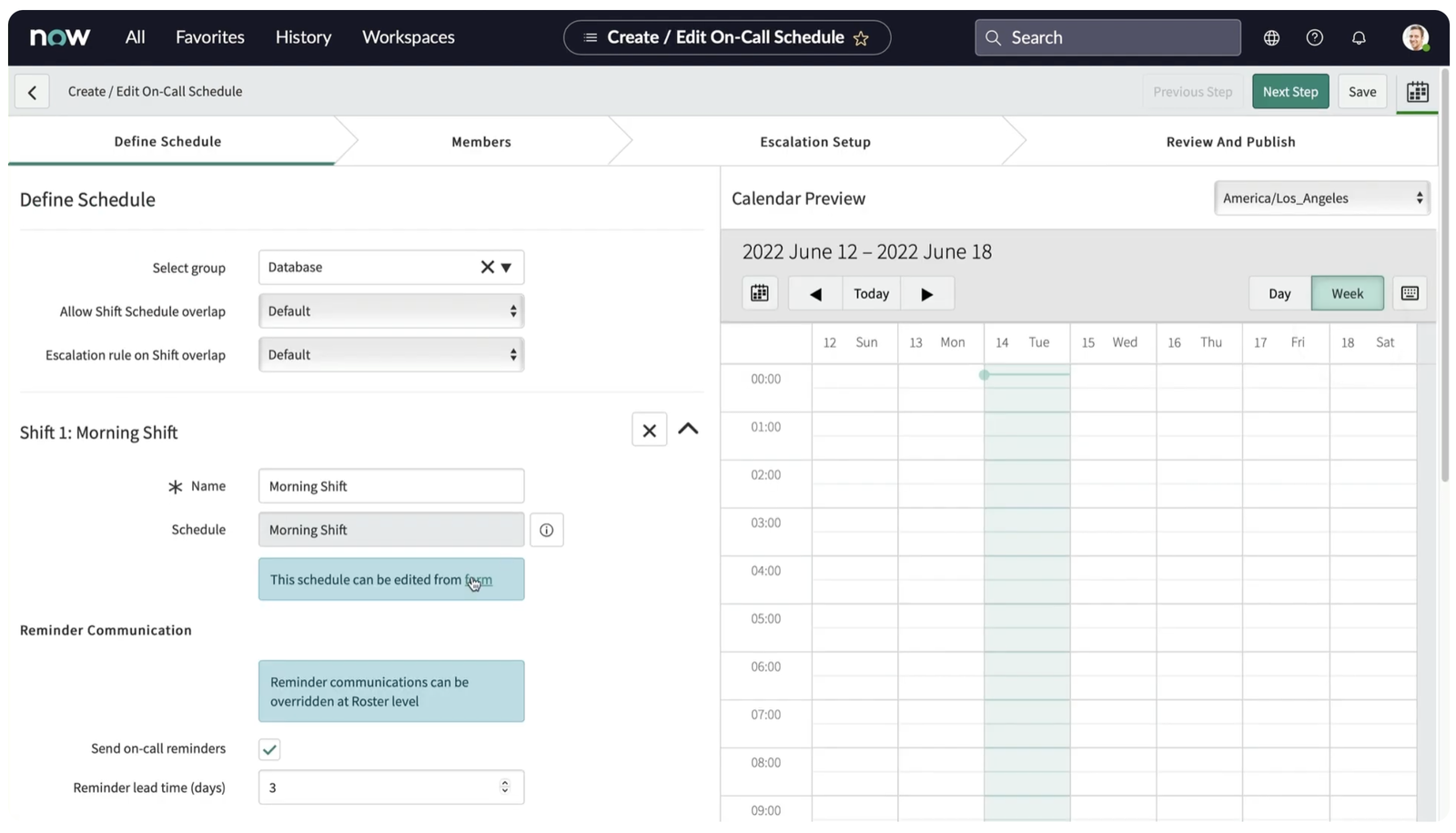 Before
Some details in this case study have been generalized to protect confidential information. All interface mockups use fictional placeholder data.
© Designed & built by Lior Shitrit with AI tools.